Temporary organisations (or projects) frequently work with uncertain timelines. Briefing senior management on the extent of uncertainty and progress towards reducing uncertainty is a crucial Project Management challenge. This article explores a visual approach to communicating schedule uncertainty using the common Gantt chart. The approach taken is to show the Gantt Chart, and then explain the various elements in it.

Key Messages
The Gantt Chart is amenable for illustrating the following project talking points.
- This project will require schedule contingency due to the parallel work involved.
- The estimates for the series and parallel tasks are identical at 100 days.
- Earlier activities have less schedule uncertainty, later activities have more schedule uncertainty. This is because later activities are affected by the accumulated uncertainty of prior activities.
- Even with uncertainty added (at +/- 20%) the Optimistic and Pessimistic Finish times for both series and parallel tasks are identical.
- But in the real world, doing work in parallel means that following activities are affected differently to activities done in series. (Illustrating merge bias.)
- The parallel tasks are likely to be delayed from a week up to a month more than the series tasks depending on how many prior parallel tasks that are depended on.
- This project will require significant schedule contingency due to the parallel work involved.
The project activities
- Series Tasks
- [Task Series 1-10] ten tasks which are in series (10 days each) .
- Parallel Tasks
- [Task Parallel 1-5] five tasks in parallel (50 days each)
- [Task Depends on Parallel 1-x] five tasks (50 days each) which depend on from 1 to 5 earlier tasks in parallel.
Uncertainty
Task duration uncertainty is frequently modeled using the BETA, Triangle, and Normal random distributions. In this example the activity uncertainty has been modeled as normally distributed with a mean equal to the task’s nominal duration and a standard deviation of +/-20%. The Optimistic/Pessimistic Duration is defined as Duration +/- 2 * Standard Deviations which spans ~95% of expected durations.
Chart Bar
Each Gantt Bar shows six events:
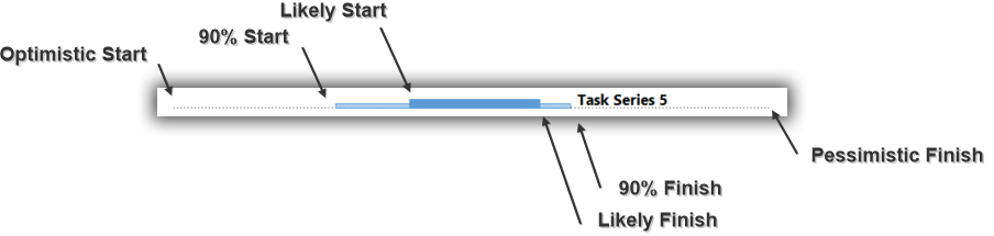
Events
| Event | How is it calculated? | |
| Optimistic Start | The Start/Finish time for the activity if every activity’s duration is the optimistic shortest time. | |
| 90% Start | Based on Monte Carlo simulation, 90% of the time the task will have started by this time. | |
| Likely Start/Finish | The most likely Start/Finish Date based on a Monte Carlo simulation. | |
| 90% Finish |
|
|
| Pessimistic Finish | The Finish time for the activity if every activity’s duration is the pessimistic longest time. |
Merge Bias
The diagram nicely illustrates Merge Bias. The last four activities all have later likely start dates. The later times are due to the increasing numbers of prior tasks that need to complete in parallel. That is, more parallel completions equals later expected start time.
How was this created?
The Likely Start and Finish times and 90% Start and Finish times are calculated using a 2000-run Monte Carlo simulation within MS Project. The code supports both the Triangle and Normal Distributions for capturing activity uncertainty. The input data and results of this run may be found as a CSV file Compare Series and Parallel.csv. The project start date was Sun 25-Feb-18 and scheduling was done from the Project Start Date with the Standard 5 day a week calendar. Let me know if you are interested in reviewing the code, and I will tidy it up and make it available on Github.
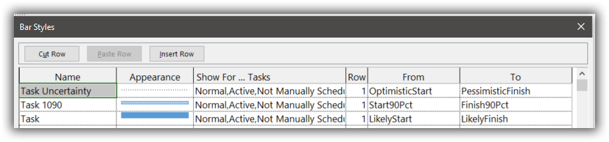
The visualisation was created using the following MS Project Bar Styles:
 Other options
While I have been unable to find an existing example of presenting the output from a Monte Carlo run as a Gantt Chart, the idea of using the Gantt Chart to present schedule uncertainty is not original. Here are a couple of prior examples:
- Chandoo.org’s Gantt Box Chart.
- Liquid planner supports what they call “Uncertainty Gantts“
There are many examples available that show schedule uncertainty as a histogram of end dates. Glen Alleman shows a good example here. Palisade have visual examples here. And a Statistical Pert example here.